
Studio Reveal: The Space That Had to Do Everything
Our garden studio is officially the home of Maquette Interiors, my husband Jack's photo and video edit suite, a guest room, a cinema room, and a shower and WC. A space to host clients, store loads of samples and equipment, work quietly away from busy family life, and somehow still feel like somewhere you'd actually want to spend time.
This space had a lot of important jobs to do. Which is exactly why this was the hardest space I've ever designed. Every decision had to work harder than usual.


The Brief: A Space With (at least) Five Jobs
Before a single moodboard was made, Jack and I sat down and listed everything this studio needed to accommodate. Not what we'd like. What it needed. That list was, frankly, scary:
A double desk workspace for two (me and Jack, different hours, different jobs)
A professional photo and video editing suite
A guest bedroom
A cinema corner for family evenings
A shower and WC — so guests could comfortably stay without traipsing through the house
Sample storage for Maquette (a lot of fabric swatches, paint chips, and tiles)
A client-facing area that looked the part when someone came in for a design consultation
Somewhere for my treadmill to go!
Access to the garage from our garden!
For reference, the studio is not enormous. So every single element had to earn its place.
The first thing I did, before colours, before furniture, before anything, was draw up a floor plan and label every zone. Workspace. Edit suite. Lounge/cinema. Guest sleeping area. WC/Shower room. And I had to fit my treadmill in! Once I could see it spatially, the design brief became clearer: this wasn't one room. It was five rooms wearing one room's coat.
The Vision: 70s-Modern, Eclectic, Playful
Once I understood the brief, I could get into the exciting bit. I knew from the start that I wanted something 70s-modern. Eclectic. A little bit spoilt with personality. Warm and lived-in, and the kind of space that feels like a destination rather than an afterthought. Although I was the designer it had to feel as much like Jack’s space as mine, and considering how much he did in the build I’m glad he loves the space as much as I do!
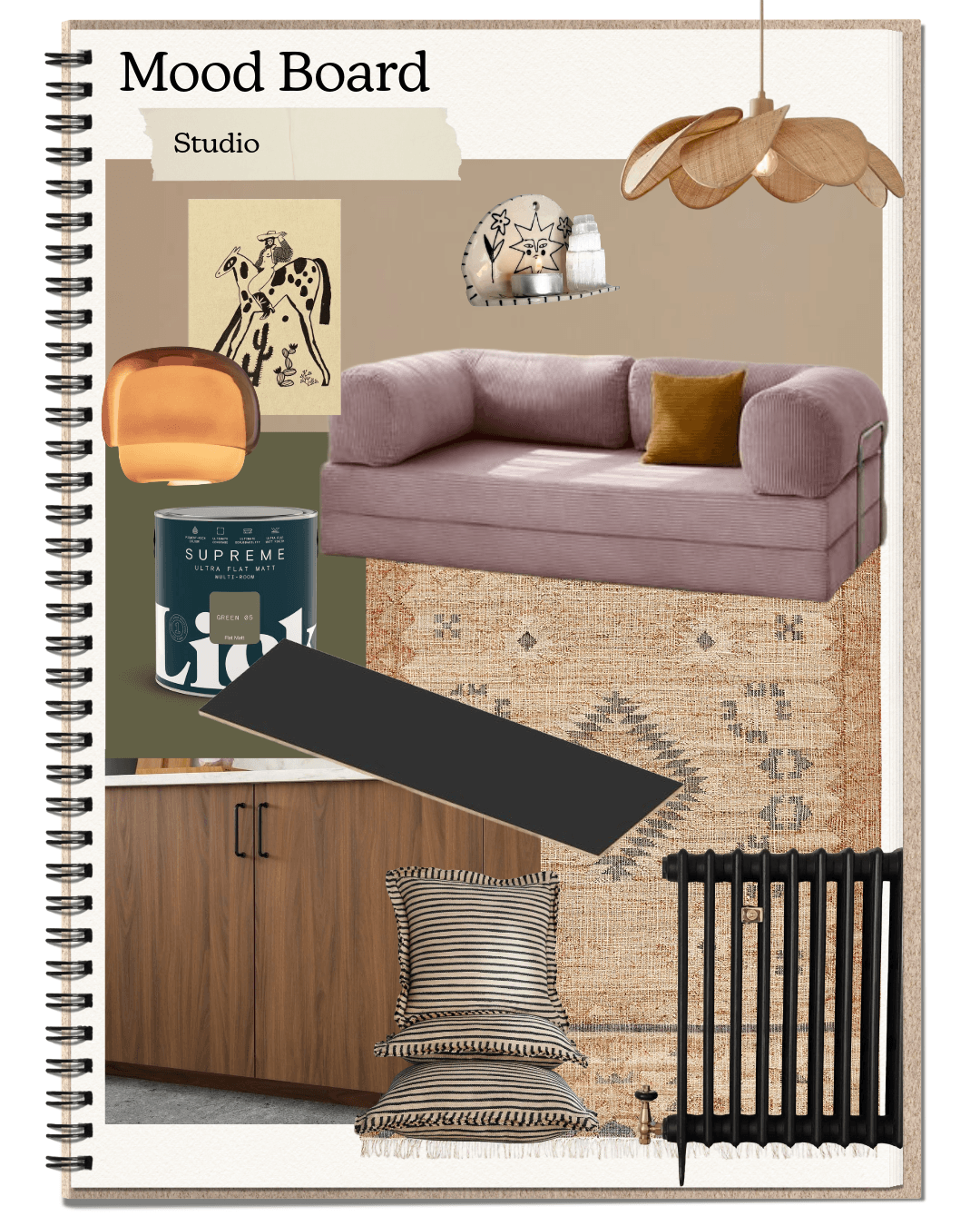
The moodboard I built was full of deep greens, warm woods, blush pinks, and mustard accents. Rattan. Arched mirrors. Gallery walls. Vintage finds alongside considered new pieces. I was reaching for the feeling of a really excellent boutique hotel room crossed with a creative studio, somewhere that works hard and looks brilliant doing it.
The Palette & Materials
Paint: LICK
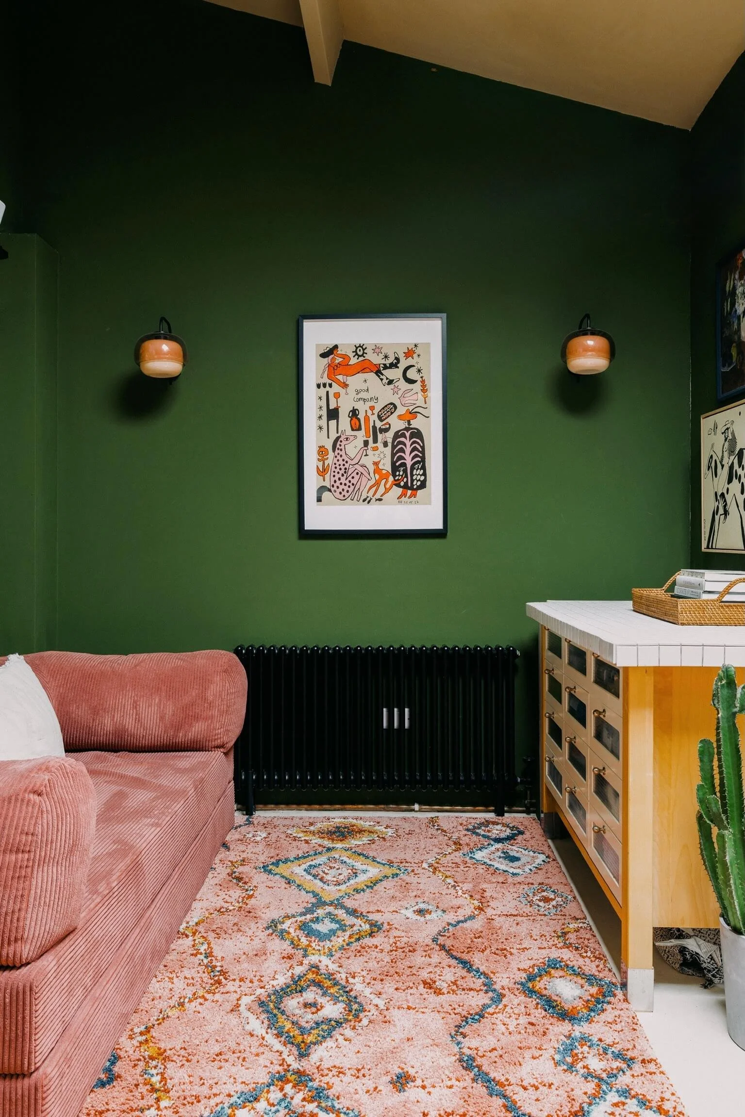
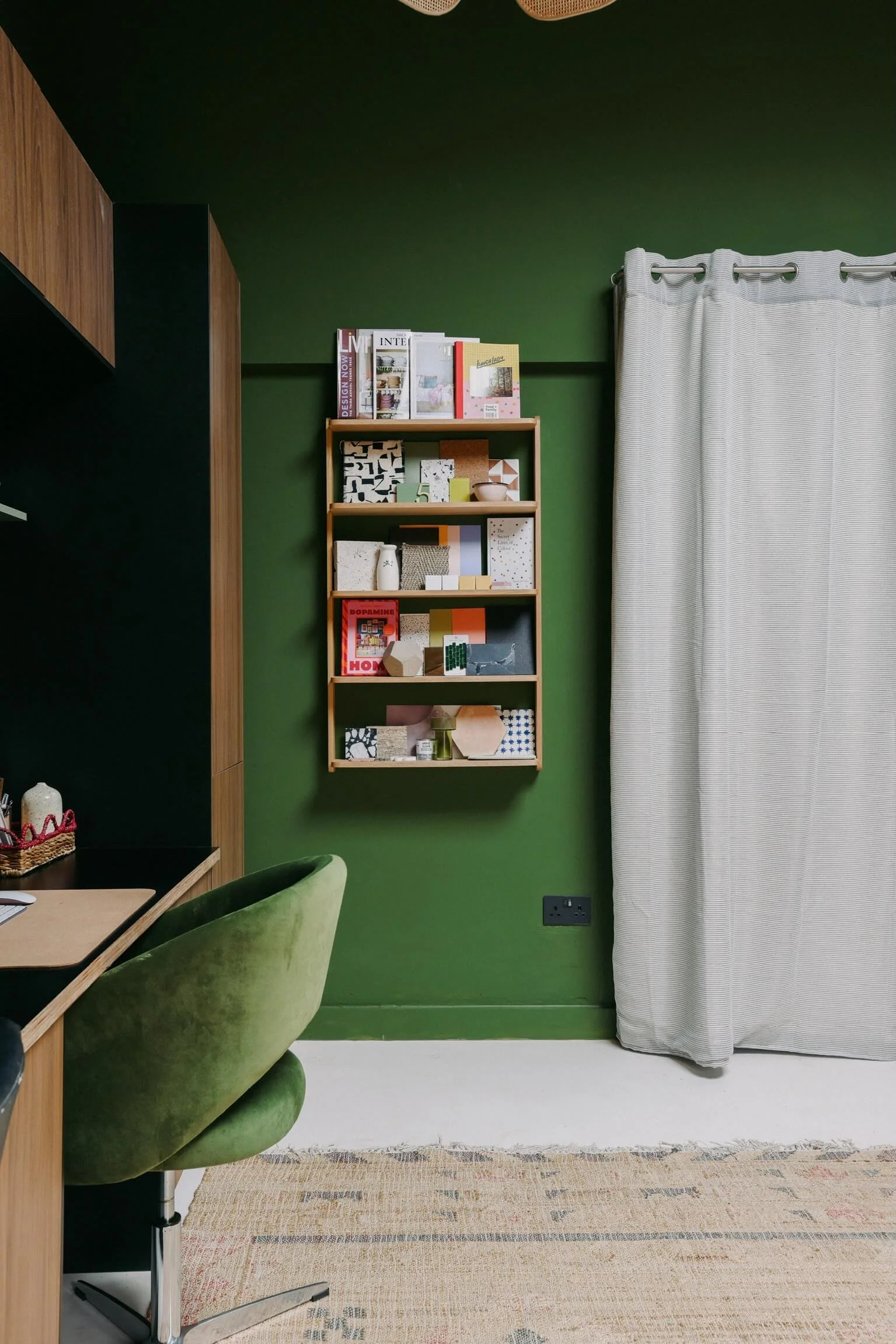
I used LICK throughout the main studio space (and my own home and many of my client’s homes!), going deep and committing to it. The walls are a rich green (GREEN 05), the kind of green that does a lot of heavy lifting in terms of mood. It makes the space feel cocooning without being oppressive, and it gives every piece of art and every warm-toned accessory somewhere to sing against. The ceiling is BEIGE 02 which is wonderfully warm and ties the green walls and walnut cabinetry together.
LICK paints have become a firm favourite in my work, the colours are beautifully considered and the finish is consistently excellent. For a space like this, where the walls are doing a lot of the aesthetic work, I wouldn't compromise on quality.
The green also solved a practical problem: it unified the different zones visually. Because every area; workspace, lounge, WC entrance, shares the same deep wall colour, the studio reads as one cohesive space even though it's doing very different things in different corners.
Flooring: Relentless Microcement
Underfoot, I went with microcement from Relentless throughout the main floor area, and I would not change this decision for anything, although I may have underestimated how hard I would find the DIY installation!
Microcement is one of those materials that works beautifully in almost any interior, but it is particularly good in multifunctional spaces. Seamless, extremely durable, easy to clean, and it photographs beautifully. It also adds to the grown-up, considered feel of the space without drawing too much attention to itself — which is exactly what a floor should do.
The warm grey tone I chose grounds the whole room without competing with the green walls or the warmer accessories. If you're designing a garden studio or any hardworking floor space, microcement from Relentless is absolutely worth the investment.
Design takeaway: In a multifunctional space, keep your floor and ceiling neutral. Let the walls, furniture and accessories carry the personality. This gives you flexibility to shift things around without the whole room feeling chaotic.
The Workspace
Storage & Cabinetry: IKEA
The cabinetry in this studio is IKEA, I dreamt of using Plykea but budget didn’t allow. Floor-to-ceiling walnut-effect units from the PAX range, combined with open shelving, make up the entire storage wall — and it looks every bit as good as a bespoke fit-out would.
This is something I feel quite strongly about as a designer. IKEA is not a compromise. Used well, with the right handles, the right styling, and in the right context, IKEA cabinetry is genuinely excellent. The key is going floor-to-ceiling (always — it's more dramatic and makes the room feel taller), choosing a warm-toned finish that works with your palette, and then being really thoughtful about what lives on the open shelves. I love styling my shelves (and trying to influence Jack’s shelf too!)
My open shelving holds: a curated selection of design books and magazines, my neon 'hustle' sign, a collection of trinkets I've accumulated over the years (much to Jack’s dismay), and some very beautiful samples that I refuse to hide away.
Worktop: Birch Ply + Black Formica
The worktop deserves its own mention, because sourcing it was one of the more unexpectedly frustrating parts of this whole project.
If you've ever tried to find a 3-metre length of worktop on a budget, you'll know that it is not straightforward. Most off-the-shelf worktops max out at standard kitchen lengths, and anything longer either requires a join (which I didn't want) or a bespoke price tag (which I also didn't want). After a fair amount of hunting, the solution was birch ply with a black Formica top, and it is, genuinely, one of my favourite material decisions in the whole room. We got ours from Laminate and Ply.
The birch ply edge is warm and honest and slightly artisan-feeling. The black Formica surface is incredibly practical — it handles everything a working desk needs to handle and wipes clean in seconds. Together they look deliberate and considered in a way that a standard kitchen worktop simply wouldn't. It sits against the walnut-effect IKEA units and the green walls and feels completely at home.
The double desk runs along the same wall, creating one long, intentional workspace that doesn't feel domestic. It's where I work, where Jack edits, and where clients sit when we're going through schemes together. Getting the desk height, the monitor positioning, and the lighting balance right took a few iterations, but it was worth it.
Speakers: Adam Audio (via Focusrite)
Because this is also Jack's edit suite, the audio setup mattered. The speakers are Adam Audio from Focusrite (a fave client of Jack’s) and the professional-grade studio speakers that also happen to look the part. They sit on the desk with a quiet authority that I appreciate aesthetically as much as Jack appreciates sonically.
The Lounge Corner
Sofa Bed: OMHU Copenhagen
If there is one piece in this studio that I built everything else around, it is the OMHU sofa from OMHU Copenhagen in blush pink corduroy.
She is spectacular. I am not going to apologise for how strongly I feel about this.
The OMHU sofa has this beautiful, rounded, generous shape — deeply 70s in its silhouette, modern in its finish — and in blush pink corduroy it is exactly as good as it looks on screen. The bolster arm detail is the thing I keep coming back to. It's the kind of piece that has real presence in a room without dominating it.
I knew early on that this sofa was the hero piece, I have been coveting an OMHU sofa for over a year, and love the modular funtion giving flexbility needed in this space. The Moroccan-style rug from RugVista does a lot of work: it warms the microcement floor, defines the seating zone, and adds a layer of pattern and colour that stops the space from feeling too clean and considered. The warm, eclectic, slightly 70s energy starts with her.
Lighting
Lighting in this studio was a considered exercise in layering. I didn't want one overhead light doing all the work — I wanted each zone to have its own lighting moment.
The rattan flower pendant over the workspace is from La Redoute, and it is exactly the kind of statement piece that earns its place. It's generous in scale, textural, and warm-toned — it stops the desk area from feeling like a corporate office and gives it that creative-studio feeling I was after.
The arched tortoiseshell floor lamp beside the sofa (also La Redoute) is the other lighting hero — providing a reading and ambient light source in the lounge zone that works beautifully in the evenings.
Design takeaway: In a multifunctional space, use lighting to define zones. Each area should have its own light source — not just overhead, but at different heights and with different warmth. It makes the space feel intentional and flexible.
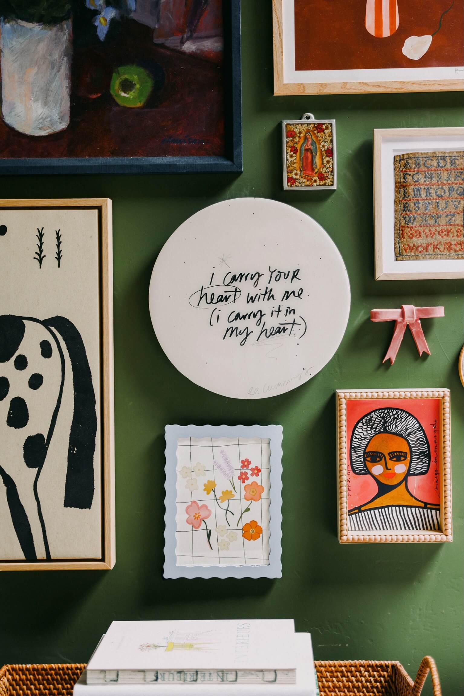
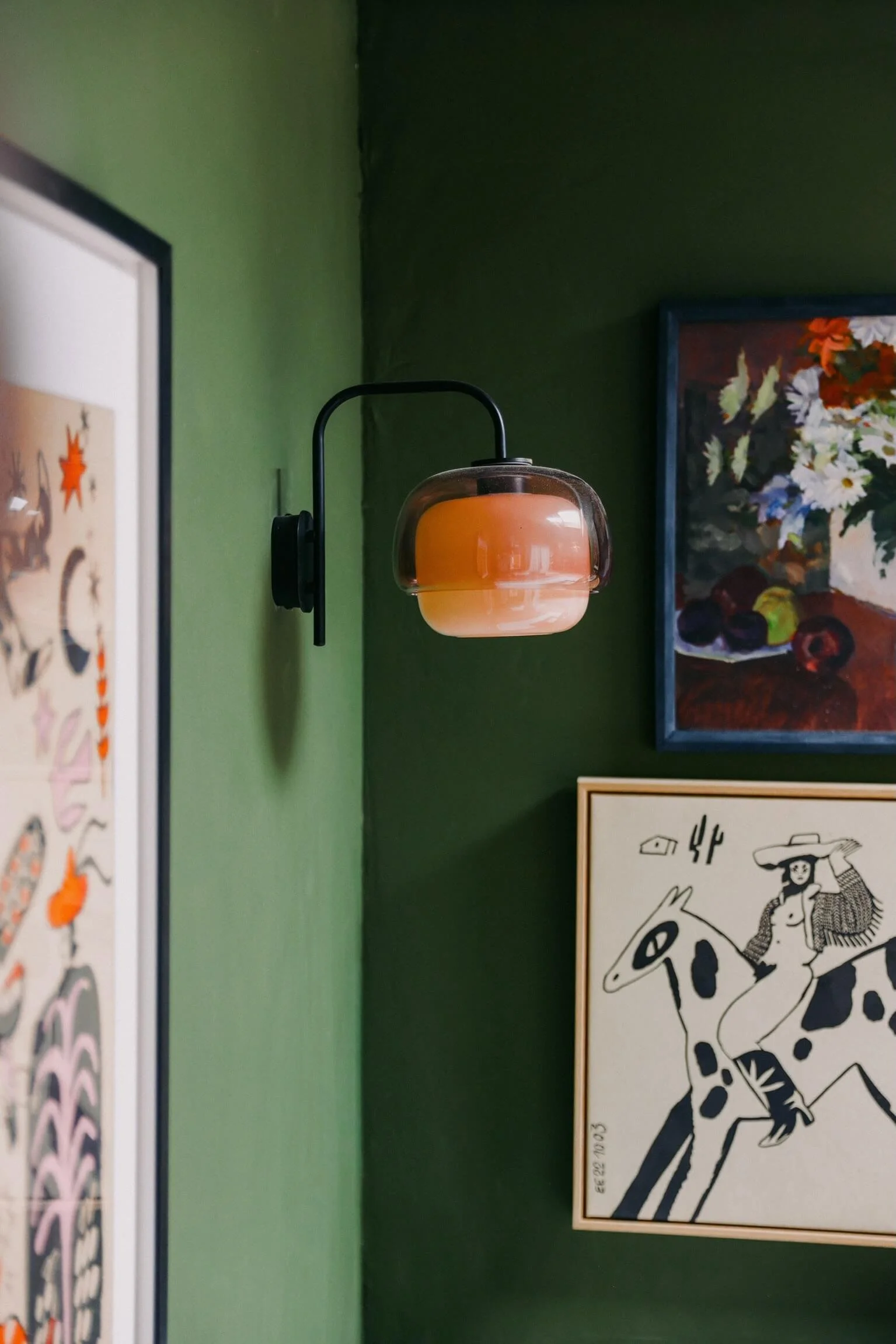
The Art & Personality
A studio for Maquette Interiors needs to feel like Maquette Interiors. Which means: personality, texture, a gallery wall that tells a story, and at least one or two pieces that make people stop and ask about them.
The yin-yang, and ‘my heart’ piece from Black List Studios is one of those pieces. It sits centrally on the green wall between two wooden wall sconces, and it does exactly what good art should do — it anchors the space and gives it a point of view. It's graphic and bold without being trend-led, which means it'll still feel right in five years.
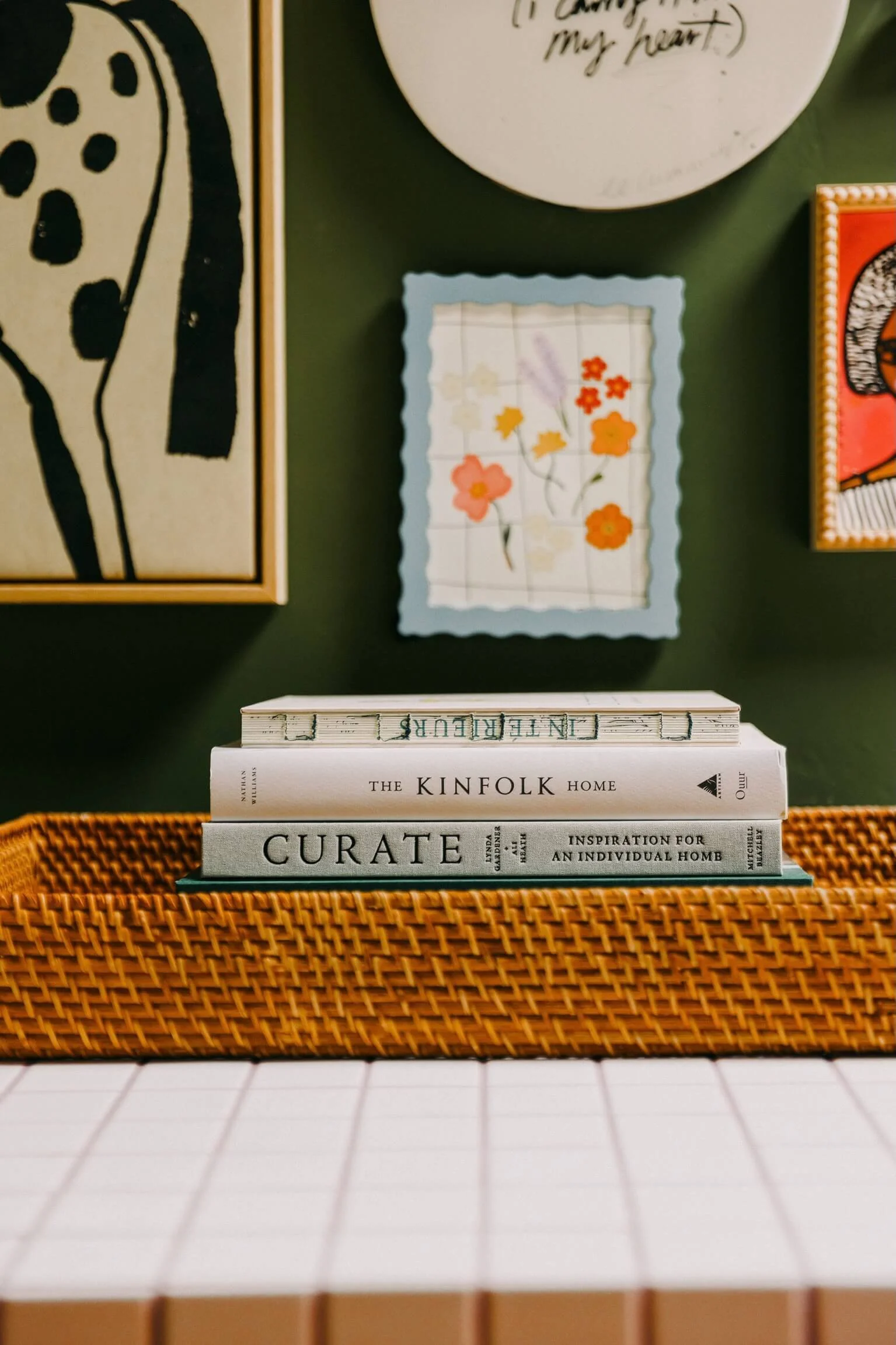
The gallery wall elsewhere in the studio is a mix of pieces I've collected over the years: a small floral painting in a blue scalloped frame, illustrated prints, objects that don't hang neatly under any label like my handmade ceramic bow, and a thrifted oil painting. That intentional eclecticism is very much on purpose. A space with too much visual coherence can feel like a showroom. I want this studio to feel like someone actually lives and works here.
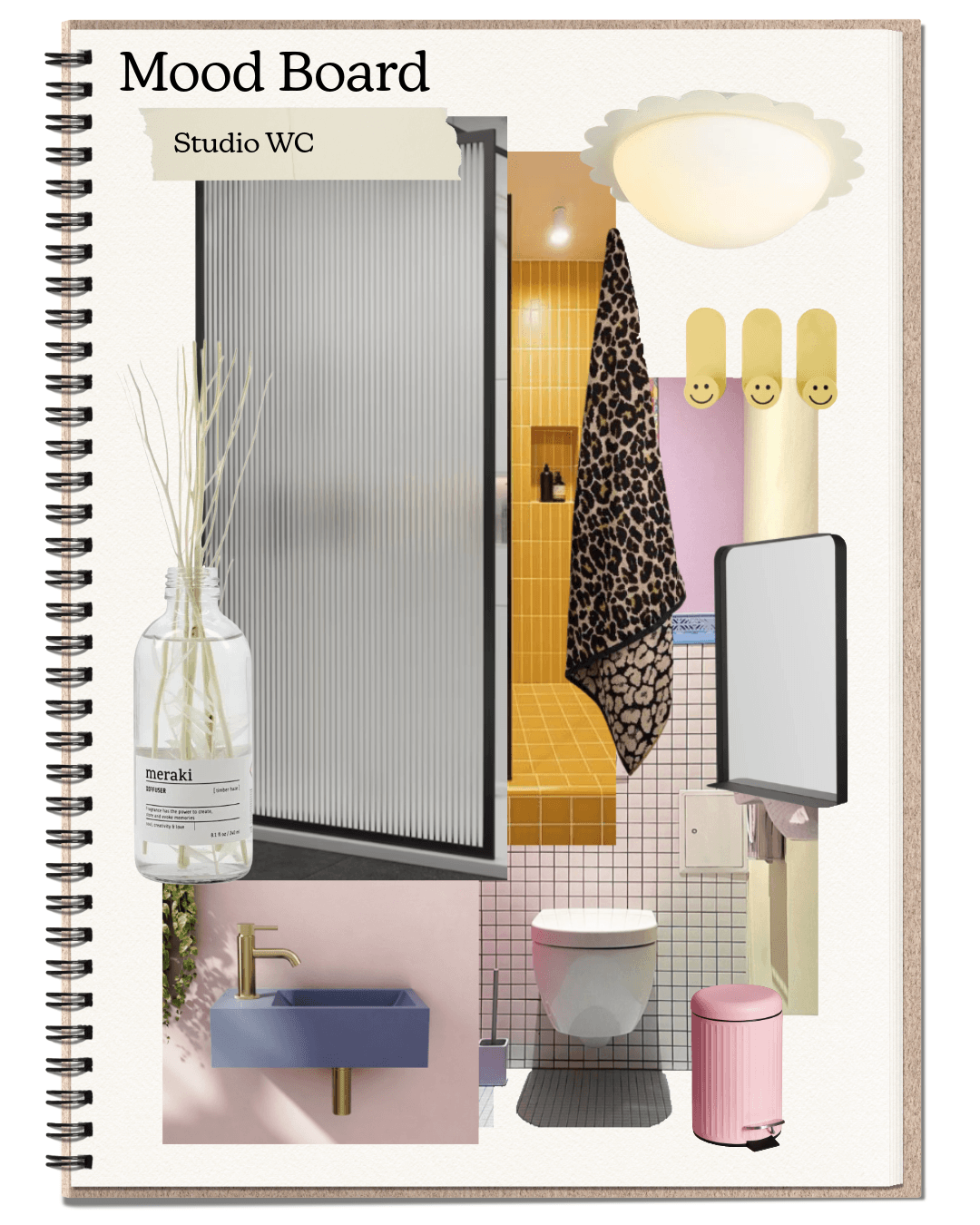
The Shower & WC
Bathroom Suite: Drench
I'll be honest, the WC/shower room the part of this studio that I was most nervous about. Fitting a full shower and a WC into a garden studio without it feeling like a service corridor is a genuine design challenge, and I was very aware that it could easily let the whole thing down.
It didn't. In fact, it might be the bit I'm most proud of.
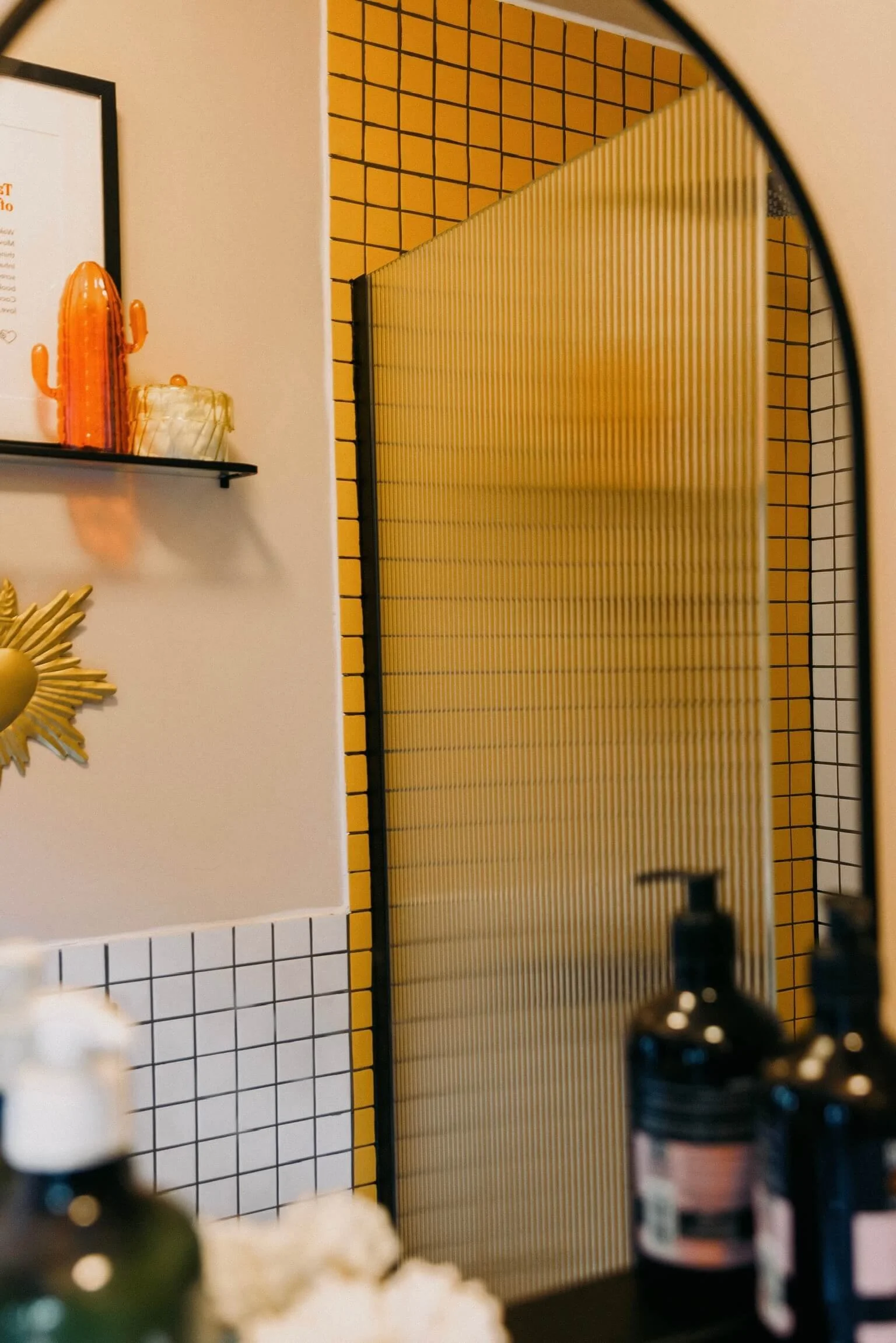
The bathroom suite is from Drench, a wall-hung WC, a walk-in shower, statement tiny sink, and clean, well-proportioned fixtures that don't fight for attention. The big design move was the tiling: mustard yellow square tiles from Tiles Direct in the shower, paired with white square tiles, and ribbed glass for the shower screen. An arched black-framed mirror completes the look.
The result is a tiny yet practical room with a huge amount of personality. The mustard tiles (a reference to warm accent running through the whole studio) make it feel deliberate and designed rather than an add-on.
What I Learned Designing My Own Space
Designing for clients is one thing. Designing for yourself is entirely another.
When it's your own home, your own money, your own lived experience of the space every single day, the decisions feel heavier. I second-guessed the green walls about six times. I nearly talked myself out of the blush pink sofa at least twice. I had a brief crisis about whether the mustard tiles in the shower were too much.
What I kept coming back to, and what I'd say to anyone designing a multifunctional or challenging space is this: trust the feeling you identified at the start. When you have a clear emotional brief you always have something to measure decisions against. Does this support the feeling? Yes or no.
The other thing I'd say is: don't apologise for investing in one hero piece. The OMHU sofa is not the cheapest item in this room. But it is the piece that makes the whole thing work. Spending where it matters and being smart (hello, IKEA cabinets) elsewhere is not a compromise. It's good design.


Shop the Studio
Here's a full roundup of the brands and pieces that made this studio what it is:
Sofa — OMHU Copenhagen | Blush pink corduroy
Cabinetry — IKEA | PAX wardrobe system, walnut effect
Paint — LICK | Deep forest green
Flooring — Relentless Microcement | Warm grey microcement
Bathroom suite — Drench | Wall-hung WC, walk-in shower
Art — Black List Studios | Yin-yang wall piece
Lighting — La Redoute | Rattan flower pendant + arched floor lamp
Rug — RugVista | Moroccan-style pink rug
Worktop — Laminate and Ply
Tiles — Tiles Direct | Mustard yellow square tiles
Studio monitors — Adam Audio via Focusrite
Want Your Own Space Designed?
If this studio has given you ideas for a space of your own, whether it's a garden room, a home office, a spare bedroom that needs to work harder, or any space that's trying to do too many jobs at once, I'd love to help
This is exactly the kind of project I live for. The harder the brief, the better.
Follow along on Instagram and Pinterest for more projects, moodboards, and the occasional behind-the-scenes reality of designing your own home.